Friday, 6 March 2009
Thursday, 5 March 2009
How does your media product represent particular social groups?

How does your media product represent particular social groups?
Appearance
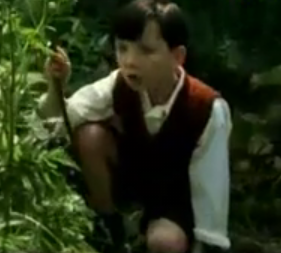
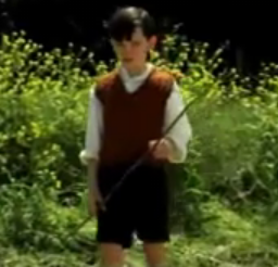
Both characters are similar in terms of appearance, they are both about the same age (8) and their appearance is similar due to clothing. They are different gender which is one of the only significant differences.
Costume
Their costumes are the same in terms of time setting and clothing. They are both in old clothing and I have considered Mise En Scene in my opening and have dressed my character in what i believe was the correct clothing for the time setting. My character's costume is in black and white, and the young boys in is colour in this film, but they share the same idea and principle about olden day clothing.
Role in film
both the characters role in the films are almost exactly the same. They are a child in a time when there is massive conflict and war happening - and the film is from a child's point of view. I think this is the best example in terms of similar characters for this aspect of the role in the film. The young protagonists both look up to their father in my film and 'The boy in striped pyjamas' and this is also a very good similarity.
What kind of media institution might distribute your product and why? How did you attract/address your audience? - Final opening with Voiceover
Here is my final film opening with the voice over added over the top in a kind of 'directors commentary' way. To make sure the voice over was loud enough, i have gotten rid of the music as this overshadowed the voice over for this version. The Russian is still in there though, but just quietened down.
Overall i think the voiceover does explain quite a bit, and helps to help the audience understand my film a little bit more, for example who i aim to address as an audience, who would distribute my film etc.
Wednesday, 4 March 2009
Who would be the audience for your media product?
Feedback from Jake & Jim
In today's lesson, we had media professionals Jake & Jim in our lesson, who have produced music videos, adverts and films - in to help us with our work and give us some helpful feedback on how to make our opening better for next time.
The feedback i got was very helpful and will help me in future projects. They thought my film opening was a bit different in the sense that it was not a conventional film opening - and it was not very stereotypical of an opening. They believed the dialogue and subtitles made the film opening look a bit like a trailer - but once i explained it was a bit different and similar to a monologue - they agreed and thought it was interesting I had not taken a stereotypical route.
They liked the shots of the tanks to establish setting, and the pan away of the house they thought was very effective. They also liked the pan away of the young girl - as they thought this showed her emotions well.
Overall I think this feedback was very helpful, and if I had more time i would change some of the things they mentioned, such as the 'jittery camera' on all the shots rather than on some and not on others, and would take on their advice to help my film opening look a bit better.
This feedback also links to the evaluation question of How did you attract/address your audience? I think getting feedback from media professionals helped me to understand what audience would be attracted to my film and who would favour a different film. Jake & Jim thought my film was a bit different in terms of it was not a convential or stereotypical foreign film, but they still understood who the target audience would be and agreed it would be a foreign audience or the older audience who have a good amount of knowledge about WW2.
Who would be the audience for your media product?
Feedback from Level 2
We were then given a sheet of feedback from Level 2 Cm diploma, which was helpful to us in terms of what went well and what did not go so well. They were given set questions and asked to explain them.
This also links to the evaluation question of How did you attract/address your audience? I think getting feedback from level 2 helped me to understand what audience would be attracted to my film and who would favour a different film. When answering the question of who the target audience would be, they write "A foreign audience as it isn't in English". I think this is the audience i hoped to attract, as well as an older audience who have considerable knowledge about WW2.
What kind of 'genre' do you think the film belongs to? Why?
I think this is a 'war' film as the little girl talks about missing her dad who is sent away to war. Also It could also be labelled a 'foreign' film as the film is both German and Russian.
Who do you think the 'target audience' of this film would be? Why?
A foreign audience as it isn't in English.
What's your favourite image from this film? Why?
The young girl standing with the hat, as i think she is missing her dad and this shows her emotions well.
What have you learnt about technologies from the process of constructing this product?
In Final Cut Express I have used various effects, for example I have used motion keyframes to add motion to still images, and have used the pen tool to fade both pictures and music both in and out, which helped considerably in my opening, as these effects both helped when i was editing my opening sequence.
In Adobe After Effects, I have also used new effects which i did not know how to use before, therefore learning new techniques. These two effects were the glass smash effect, which was called Shatter in the effects toolbar of After Effects. This is exactly what i wanted and fitted well with my opening sequence, as it symbolised breaking of the family and the girls emotions.
I also used After Effects to edit a version of my individual Long road logo, where we made the letters and symbols of the long road logo move in the way we wanted them. I used After Effects for making my own ident logo too, which symbolised me and my media industry. This was a good editing program to use as we were then asked to put the two logos at the front of any media work we done, branding it as our work.
On YouTube I have uploaded all my videos i have done for my media work, aswell as finding videos and examples to help me with my coursework, which i then edited and modified. I have also found other students work off YouTube and studied this, which helped with my research when i put it onto my blog, as I explained what I liked about the sequences. YouTube is where all of our media videos are uploaded too, so it helps us as a source from where to get our videos from if we are not on the same computer all the time.
On the websites Stockfootageforfree.com and 1001freefonts.com i have researched both fonts and footage which I think will be helpful in my own opening sequence. For the free footage, I found a great establishing shot of the leaves which i have used in my film opening. Also, for fonts, i have used 1001freefonts to find a Russian font which i thought looked better in my opening sequence than a normal font like Arial etc, as my film was set in ww2 and the font i used symbolised this.
What have you learnt about technologies from the process of constructing this product?
What have you learnt about technologies from the process of constructing this product?
In my film opening project, i have used and learnt a various amount of technologies, with the visual side shown below. This picture shows images of a Tripod, a HD camera, a microphone (for recording the Russian) and a Macbook for editing purposes.
The main picture shows me using all of these technologies, with the Macbook and camera in the shot also. Then below this is all the editing programmes i have used, such as Final Cut, Adobe After Effects, Garageband, (with screen grabs from all of these) and then websites i have used to help with my opening sequence, for example www.1001freefonts.com and www.stockfootageforfree.com.
I think this picture on the below post shows clearly and effectively what technologies I have used in my film opening project. Also, the screen grabs of me using the editing programs is a good idea as it gives a visual interpretation as well as a written one.
The editing programs all interlaced together when making my film opening project. After Putting all the pictures and video into Final Cut Express, you would then drop this into After Effects to make an editing effect such as the screen smash, and then you would import it back into Final Cut with the effects added. You would then get the music from Garageband and add this into Final Cut with the video. You would then when finished export this using Quicktime Conversion onto YouTube. You then embed the file into Blogger from YouTube. They all interlace in some way which I think is very effective in explaining how the editing programs were used.
Looking back at your preliminary task (the continuity editing task), what do you feel you have learnt in the progression from it to full product?
From our first preliminary task, I did not have a lot of knowledge about continuity as we had only just started the course. Since then, i now know how continuity works after doing another continuity exercise and editing it all myself, it is quite hard to get it all correct. I have learnt when editing it it is best to edit in in certain 'action points' and shoot from both angles and then cut and put into a correct order.
I did not know that continuity errors can be so easy to make, therefore it is essential to pay attention to small details such as nothing has changed during the sequence, for example if a door is open in one shot and closed in another, this is a continuity error and these errors are often easy to make.
While doing the continuity task we learnt an extensive amount about editing, such as breaking the 180 degree rule, shot reverse shot, over the shoulder shot etc and I think this has helped me, perhaps not in my opening sequence as i did not film much, but in anything i shoot using a camera.
My film opening sequence is more similar to a montage rather than a continuity editing film opening. I did not shoot alot, favouring to have dialogue and subtitles explain the story rather than alot of various shots - and because of this i think my film is more like a montage than a continuity film opening.
Similar Keyframes - Narrative
Similar Keyframes - Camera Movement
Similar Keyframes - Visual Effects
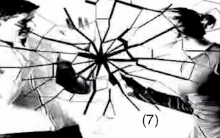

These images are similar, not in terms of visual effects but in terms of frame and overall storyline. The parents are arguing in both pictures, and one is taken from 'The boy in striped pyjamas' while one is from my opening sequence. I chose these two shots as i think they are very similar in terms of the storyline.
Similar Keyframes - Setting
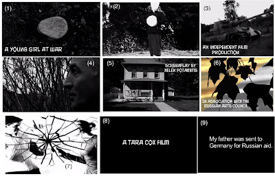
Key frames Explanation - Bottom row 7-9
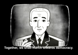
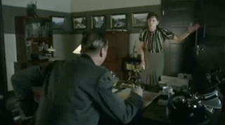
Visual Effects
I only had a couple of visual effects in my film - and i decided to choose the keyframe I have because I believe it is one of the most important keyframes and shows more depth than the other effects. I have used a screen smash effect, found in After Effects, and have used this to make the screen apear to look smashed, when the two parents are arguing. This is very similar to a shot in the film 'The boy in striped pyjamas' where the parents are arguing. It is not the same shot, as i have used a still picture rather than filmed the arguing, and although the screen does not actually smash, i think the principle is the same.
Typography
For typography, i have used a keyframe of my Russian '10 cent soviet' font to show the type of font in my film and to symbolise that the film in Russian. I do not know a film that has a similar font to mine, and think it would be quite hard to find one, as the font is unique and i have researched films but none of the fonts are similar to the font i have used.
Narrative
For the keyframe of narrative, I have used the keyframe of some of my subtitles for my dialogue, and think this shot is very similar to the film of 'Persepolis' where they use subtitles and french dialogue. I think the shot of my subtitles represents narrative very well as the subtitles and dialogue in my opening sequence are the main thing that tells the story.
Key frames Explanation - middle row 4-6
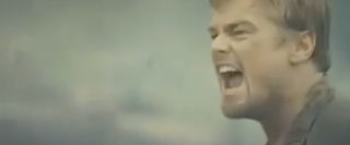
Framing
My fourth main keyframe is to do with framing in terms of a shot. My keyframe i have chosen for this is the pan across shot of the young girl's father, which is in my opinion framed very well - the shot makes the character look defiant and strong, and a close up of the characters face shows emotion. I think this is similar to the film 'Blood diamond' yet again, and similar to a very particular shot in which Leonardo Dicaprio is framed in exactly the same perspective.
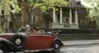
Camera movement
For my next main keyframe to show camera movement, i have shown a pan away shot of the house the young girl leaves when she moves to Germany. I think this is an effective shot as the camera pans away from the house, in a way showing the girls eye - view when she leaves - which i think is very effective in the way it does this as it gives you an idea straight away that the young girl is moving somewhere. It is similar to the shot in 'The boy in striped pyjamas' when the young boy moves house, and you see the car driving away from teh house. The shot may not be the same, but it still shares the same aspect and idea as my film opening.
Transitions
For my transitions key frame, I have used the shot at the very start of my sequence, when the shot of the leaves goes from colour to black and white. This symbolises two things - one, it also symbolises time as going from colour to black and white shows the film must be set in olden times, and two, it symbolises the girl's emotions - at the start of the film she is happy but when they move she starts to feel unhappy - and I think this shot symbolises her feelings.
Key frames Explanation - top row 1-3
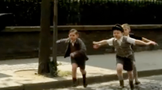
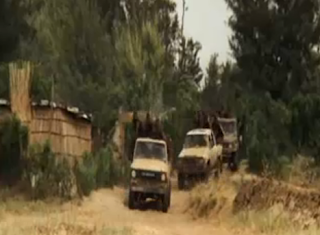
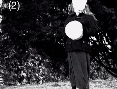
Costumes/props
For my first key frame I have used a prop of the hat i have used in my opening sequence. I think this shot is a good keyframe to show costumes/prop wise as it shows i have thought about Mise En Scene and props in my opening. I also think this film is similar to 'The boy in striped pyjamas' in the way the costumes and relevant props are arranged so that they match the clothing at the time of WW2.
Lighting
My second main keyframe is to do with the lighting in my film opening. Because my film was mostly black and white, it was hard to find a shot where the lighting helped considerably and showed contrast and brightness. However, the shot for keyframe 2 i have chosen - i believe is very effective in the way the lighting sheilds the young protagonist's face - almost as if suggesting you should not see the face of the young girl. I think this is similar to any black and white film, as the lighting does not give away alot about the characters.
Settings - time etc.
My third keyframe i think is very effective. It is of the establishing shot near the start of my film opening, where the tanks are shown. It is a very strong vivid image of a tank, and this immediately suggests war or a time when conflict was happening. I think this is a good idea of setting, as it reveals the time of the film almost immediately when the film is shown. I think it is very similar to the film 'Blood Diamond' in which at the start of the film trucks and guns are shown to symbolise a time when there is confict or war.
Key frames numbers
I have numbered each key frame on the picture on the below post to match to these explanations above about what the key frames are in terms of. For example key frame number 1 would be relevant to costumes or props, and so on.
(1) Costumes/props
(2) Lighting
(3) Settings - time etc
(4) Framing
(5) Camera movement
(6) Transitions
(7) Visual effects
(8) Typography
(9) Narrative
(1) Costumes/props
(2) Lighting
(3) Settings - time etc
(4) Framing
(5) Camera movement
(6) Transitions
(7) Visual effects
(8) Typography
(9) Narrative
Tuesday, 3 March 2009
Invoice Questions - Action plan
Identify three practical/technical skills you feel you would like to work on developing. How could you organise this for your next project?
- I need to offer my help to perhaps a few new people, and this would in turn broaden my range of people who i have helped.
-I need to develop further my knowledge of final cut and after effects, as this was what i spent the most time on, and needed help with certain small things which i now know. If i can develop my knowledge of these editing programmes even further, this will hopefully allow me to spend less time on the editing programmes and i can get my work done quicker.
Choose three people you did not assist or get assistance from in this project. How could you go about identifying ways in which you could be of assistance to them on their next project?
-Alie
-Philippa
-Alex
none of these people recieved or gave me assitance in this film opening project, so i will try and make sure i help these people in future projects and will then benefit from helping a wider range of people. I could give them ideas for the next project, or could help them with any imformation or anything they are unsure how to do if i know myself.
Invoice Cloud
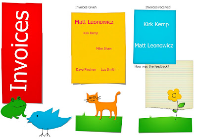
Here is my 'invoice clouds' which i have added to my blog. We were asked to create a document in which to show our invoices, for example if you had invoiced someone once, they are in small size 12 font, but if you invoiced them twice, the font is 24 and so on.
This is the same when looking at invoices someone else has given you. We then had to sort the invoices into order of best feedback, for example how many lines they had written, if they had written not alot then this would not be as good amount of feedback as someone who had given 2 sentences or more feedback.
Research - Schindler's List
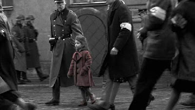
Films similar to mine in terms of time setting and character wise. This is another way in which my film challenges particular social groups.
Schindler's List is an American 1993 biographical film about Oskar Schindler, a German businessman who saved the lives of more than a thousand Polish Jews during the Holocaust by employing them in his factories. The film was directed by Steven Speilburg and based on the novel Schindler's Ark by Thomas Keneally.
The film begins with the relocation of Polish Jews from surrounding areas to the Krakow Ghetto shortly after the beginning of ww2. (This film is similar to mine in terms of time setting and war.)
There is a scene in the film which I think is very similar to my film opening - which i did not realise before. It is the scene with the little girl in the red coat, therefore a similarity is that my opening film and Schindlers list both feature a young girl, although Schindlers list does not feature the young girl as the main character - they are very similar in terms of characters.
Schindler sees a little girl wearing a red coat. The red coat is one of the few instances of color in the black and white scenes of the film.Though the film is primarily shot in black and white, red is used to distinguish a little girl in a coat.
Friday, 27 February 2009
What would you do differently if you had an extra day?
If i had one extra day, I would make sure all the final touches are done on the film opening and ensure that there are no unrendered bit of footage which appeared on my final opening video. I would have liked another day just to have a little more time, and to get everything as perfect as i believed it could be. However, I still believe my opening sequence is as good as i can do, but the extra day would help with rendering parts and ensuring the video is done effectively, with no parts that need rendering.
Evaluation
In what ways does your media product use, develop or challenge forms and conventions of real media products? (i.e. of film openings)
My film opening challenges and uses the film opening or trailer of The boy in striped pyjamas as this was where i originally got my idea from, and i thought it would be a great creative idea to do something different, therefore aiming towards the foreign area of film. It uses the idea of a story with a young protagonist in the time of war. My film opening also uses the idea of persepolis, using the idea of subtitles to help the audience understand what is happening. Although it is not an animation, it still follows the same idea - also similar to Pans Labyrinth. I also studied the title order of independent films such as Napoleon Dynamite and used this order in my film opening sequence.
How does your media product represent particular social groups?
my media project represents the social group of a fairly older audience, and features a young protagonist as the main character. The young girl as the main character represents growing up around the time of world war 2 and anyone who can relate to this would find this film interesting. The idea of the young girl moving to country to country represents the social group of anybody who has moved from one country to another and found this difficult, confusing and upsetting.
What kind of media institution might distribute your media product and why?
I think any media institution that is interested in foreign film, or any industry interested in the idea of european history. Perhaps the same industry that produced Pans Labyrinth or Persepolis. Maybe even a Russian industry, it does not have to be an english industry. I think they would distribute my media project as it is an in depth look at world war two and the idea behind it, from the perspective of a young girl as the main protagonist.
Who would be the audience for your media product?
My audience range could be between the ages of around 16 or anything above, really for anyone who enjoys european history. It could also represent the social group of not just an english audience, but a Russian too and perhaps even a German audience.It is an independent film so is not produced by big companies such as warner bros etc, and appeals to anybody who is interested in world history and real life drama.
How did you attract/address your audience?
The brief gave a suggestion of what audience we should aim for or to appeal to, but my brief did not give an audience so this was quite open in the way we appealed to our audiences. I thought a war film would be a good idea to appeal to older audiences and i liked the idea of combining my knowledge of history with my media. We attracted our audiences simly by how our film would be, the time and date set, the outfits worn and the actual idea of the film all contributed to what audience we were aiming to appeal for. I appealed to an older audience by making my pictures black and white and the film, as this sets the film in olden times such as WW2. I also appealed to a foreign audience by having Russian dialogue, with english subtitles, appealing to both a Russian and English audience - and maybe even German due to the fact the young protagonist moves to Germany.
What have you learnt about technologies from the process of constructing this product?
I have learnt an extensive amount of knowledge of how films are made and what distinguishes one film from another when constructing my media project. I learnt the difference between independent films and international films, and how the titles should be arranged in both of these aspects. I learnt the difference of titles in a film trailer and a film opening, and also studied independent films and got the title orders from this to use in my sequence. I also learnt what to put into an opening sequence, not to give too much away but simultaneously try to explain the story in a mere 2 minute clip of the film. Ths was a lot harder in my opinion than making a film trailer but the experience i gained from this will help me extensively in future projects.
Looking back at your preliminary task, what do you feel you have learnt in the progression from it to full product?
From our first preliminary task, I did not have a lot of knowledge about continuity as we had only just started the course. Since then, i now know how continuity works after doing another continuity exercise and editing it all myself, it is quite hard to get it all correct. I have learnt when editing it it is best to edit in in certain 'action points' and shoot from both angles and then cut and put into a correct order. I did not know that continuity errors can be so easy to make, therefore it is essential to pay attention to small details such as nothing has changed during the sequence, for example if a door is open in one shot and closed in another, this i a continuity error and these errors are often easy to make.
Film Opening Sequence Final
Here is my final for my film opening sequence. Overall i think everything went well, but I could have benefitted from a little more time. Other than that i am generally pleased with this opening sequence and think the Russian dialogue goes excellently with the mood i was trying to create.
Thursday, 26 February 2009
Class Feedback
Today we were given feedback from each member of the class after showing our video of our rough cut to everybody. I now understand what i need to do to change my film opening and make it better. The feedback i received was mostly positive, with some points about how i could improve my opening.
The class believed in summary that:
Font was too bland. Here I am going to use a Russian typeface which i have explained on my earlier posts below here, i simply used Arial to see what the whole idea would look like and to have some text in the rough cut, to judge what the text looked like on the pictures and what was the best place on the screen for them.
There were too many shots of the tanks. With hindsight i can now see that too many shots of tanks were used, and the focus should be more on the main character (the young girl) rather than the tanks. Perhaps one or two shots would be effective, as they establish the location and date, but more than this is unnecessary.
Shots were too fast and could be slower. I agree with this, and getting rid of some of the shots could benefit my film as i would have space to lengthen the shots appropriately and for the class to fully understand what is going on. I now realise that there were a little too many shots in the sequence.
Avoid using the same shot twice. I think this is good advice, and the shot of the tanks was used a bit too much.
We need some more focus on the main character. I agree with this, and getting rid of some tank shots but then adding stills of the young girl will help to shift the focus more onto her and her emotions, which should then help the audience establish her as the main character. I only have some footage of the young girl, so I will take some still shots of her from the footage and add this into the sequence.
The text on the screen needs dialogue. I agree with this, and am going to put dialogue on it, i just simply put the text on the screen for the rough cut so i know what order it is in and it also helps the audience understand the opening a bit more. The dialogue will be in Russian, with the text in English for subtitles.
The titles could be in Russian. This seems like a good idea, as at the start the title 'Russian Arts Council' suggests the film is in Russian, however i don't think all the titles should be in Russian, as this would be too complicated and not necessary if i am having Russian dialogue as well. I think that if the Title of the film was in Russian this would be effective, it could then fade to English or vice versa and this i think would be a good effect.
It needs a soundtrack. I did not have time to upload the rough cut with sound as i had not found the right track, but now i think i have found the perfect soundtrack for my film, with the music changes after the glass break picture, here the music will be more calm and relaxed, sounding a little melancholy to also symbolise the girl's feelings when she has to move from Germany. Also, i may remove the sound of the glass smash and just have the music when the screen smashes, but have the music change at this point, i think this may be more effective than the glass breaking sound effect.
Wednesday, 25 February 2009
Rough Cut
Here is the Rough cut for my film opening sequence. I think it is almost there in terms of editing, but still needs the sound and dialogue added, then i think it will benefit a lot from this. Overall i think the rough cut follows the storyboard quite well, it is not shot for shot, but it is in the same idea and you can see where my ideas have originated from and grown.
The font will also be changed in the final opening sequence, as the font i have used currently is just a plain font used to try and see what the opening sequence would look like, and i was focusing more on putting everything together, not the font at this time. I have two fonts in which i am going to choose from, deciding on which one looks better on final cut and in my opening sequence. Therefore, the font is simply Arial for now and for the rough cut.
The font will also be changed in the final opening sequence, as the font i have used currently is just a plain font used to try and see what the opening sequence would look like, and i was focusing more on putting everything together, not the font at this time. I have two fonts in which i am going to choose from, deciding on which one looks better on final cut and in my opening sequence. Therefore, the font is simply Arial for now and for the rough cut.
Tuesday, 24 February 2009
Points of advice for future filming
- Make sure the actors are ready and available at the appropriate time i want, otherwise this could potentially be a problem for future filming.
- Continue to shoot the shots a various amount of times to ensure the shot is effective and no tiny errors or mistakes are made.
- Think of atleast two suitable locations to film, as the location could not always be available or what you think it appears to be. Always take test shots before and check out the location to ensure it is ok to film there.
- Organize the day so that I always have time to film and that the filming is not rushed, as this would appear in the final film. Make sure on the day/s I am filming that nothing else preoccupies the day or gets in the way of filming.
- When shooting, always use a tripod as when handheld the camera can be very shaky.
Overall best moment during project
My overall best moment during the film opening project would be when i was actually filming. When I had the HD camera, and found a perfect location, this was overall the best moment as i felt i had accomplished filming - and when i began to film and noticed that the shots were really effective, this made me feel like i had progressed in the course and project.
I was also extremely pleased with my location, and as i had chosen two beforehand, i was lucky as when we got to the first chosen location, it wasn't what i had wanted at all and it was alot more modernised - it did not fit the criteria for an appropriate location. We then went to my second location, which was the Science Park, and found this was actually a lot more suited and relevant than the last location.
I was also extremely pleased with my location, and as i had chosen two beforehand, i was lucky as when we got to the first chosen location, it wasn't what i had wanted at all and it was alot more modernised - it did not fit the criteria for an appropriate location. We then went to my second location, which was the Science Park, and found this was actually a lot more suited and relevant than the last location.
Friday, 20 February 2009
Final Font


Here are the two Russian fonts, and as you can see from a text preview the second font is quite hard to read, and some letters look capitals even though they are not, such as the letter N n the word 'didn't'. Therefore i will download both these fonts and take them into college to work on them in Final cut and make a final decision which font looks overall better.
Fonts


These are my four final fonts to make a decision on. The final font i think will not be calligraphy like i originally thought, but my other decision of a font style of a 'Russian font'. The two Russian fonts are the two fonts on the bottom of the 4 above. I think either one of these two will be good in terms of a final font, to go on my final film opening project. They will be on a black background and the font colour would be white, similar to the arrangement of my font on my Animatic.
Thursday, 19 February 2009
Overall, how did filming go?
Overall i believe filming went very well on monday/tuesday. I think the location was great and i am glad that i found a good location to film in. We had to make sure there were no buildings in the area, as the buildings are all modernised - so we simply found a very grassy area with lots of trees so we went there. We went to more than one place at the science park and spent quite a while finding the correct location which i thought would be suitable.
I think using the HD camera was excellent and much better than the ones we normally use. I liked how sharp the image looked on the camera, even with black and white with editing later i still think the footage will look sharp and effective.
We spent about 2 to 3 hours finding the location and filming. The filming was not the long part, but walking to the science park and then finding a suitable location with no modernised buildings was quite hard to do. Overall though i believe filming today went great and i am glad i had planned everything before the day so i knew what i was doing.
Wednesday, 18 February 2009
What I have changed
From my initial storyboard, a few parts have changed and I think it helps to establish what parts have changed and how.
- The shot of the girl, where the camera pans away has stayed the same, but the girl is now holding the army hat instead of not holding anything, and i did this because i believe it would give more emphasis to the shot and help the audience to understand her emotions.
- The shot of the close up of the fathers face remained similar also, but he is not wearing the army hat, and you cannot notice this is the opening as i thought it was more important to get a closer shot, therefore you cannot see the top of the actor's head anyway.
- I did not do a silhouette shot of the girl growing up, i thought this was not really needed inthe opening sequence and the dialogue showed her emotional feeling when growing up by the phrase 'All my childhood memories involve conflict.' I thought this was a better way to express emotion and did this rather than having the shot.
Tuesday, 17 February 2009
Filming
 Filming
Time: 2.30 - 4.30
Actors - 1
Location - Science park


Today I went to film my shots for my opening sequence. I got the camera off Dave early/mid afternoon so i could shoot today rather than tomorrow, so i would have a little more time on my hands. We went to the science park to film, as i think this was an overall better location, with wider variety of area and shots, and a less modernized feel to the place. I took my niece (my only actor) to the science park and we found two perfect locations to shoot in. I got her to wear a long black skirt and a white top with a black coat, paying attention to Mise En Scene, as she couldn't wear anything modernized due to the time setting.
Overall i think the shooting went well, but the pan away shots could be a problem. As i explained in earlier posts, the floor of the location is uneven due to a hillside and panning away could be difficult due to this reason. Therefore i then shot in a different location with a flatter ground surface area.
However i did not pan away walking because i thought the shot could look shaky. Therefore i simply zoomed out (using the camera) very slowly so it appeared like i was panning away from the actor. I think this should be effective and therefore should be good, i also shot it a number of times in each location so that there would be no errors or mistakes. However i hope this method of shooting went alright and the camera did not appear too shaky. I made my niece (the actor) hold the hat and panned away from her holding the hat this way. This was effective and has changed from what the shot was like in my storyboard because i thought having the young girl hold the hat would create more understanding of the shot and the emotions of the young girl.
Filming approximately took 2 hours, from half 2 to half 4 at the science park. We did not shoot the whole time, the majority of time was looking for suitable locations. The weather was not a problem as it was dry and sunny today, if it was wet and rainy we would have had to shoot another day due to safety etc - so this was an overall good turnout. I just hope this will reflect in the final opening sequence. I am yet to find a shot of a puddle, as the weather ensured there was no puddles! So i will look for a puddle Tuesday to shoot. Other than this i think the shooting went the best it could have gone, and i have shot the shots a number of times in case there are any mistakes made.
Sunday, 15 February 2009
Test shots - location 2 science park


Location 2 - Science Park on Milton Road, Cambridge


Here is the second of my two considered locations. I ideally preferred this location to the other one of the youth centre as it looks older and less modernised. Here are some test photos i took when i went to look at the location and find a suitable area.
I think the science park would be an ideal place to shoot due to its marshy, muddy and forest location. It seems quiet and would be an easy and varied place to shoot - with lots of different locations to choose from as there are many lakes and rivers. It took some searching but i have finally found the area where i will shoot my short clips for my opening project.
The pictures give a good representation of what the area was like, but due to a tracking shot this may be a problem, as the area has alot of hills and is very uneven in terms of ground. However, practising with my own camera i found out that if i slowly zoom out using my camera it looks similar to a tracking shot, and is still effective, although the camera may lose focus this does not matter too much in the idea of the shot, as the idea is the young girls father watching his daughter as he drives away.
In terms of shooting though this could be a problem, but shooting in two different areas may be a solution. I could shoot on the uneven ground i found or the next location shot on a flat ground. I think the zoom will be most effective rather than walking away as i could lose balance or the shot could shake slightly where i am walking.
Test shots - location 1 youth centre


Here i have the test shots i have taken with my camera, both the green end road youth centre area and the science park, in the end considering the science park as a better option overall, it is clearer with more trees and marshy area. The youth centre has recently been built so this makes the area more modern, most of the trees are gone and there is only a small tree area, with the science park there is alot more variety and a bigger area to shoot in.
Saturday, 14 February 2009
Prop change


Unfortunately, the prop of the military hat i was going to use i an no longer get, but have found a suitable hat instead which i can borrow, it is not the same style of hat but still looks old and world war 2 like. It is a flat cap, similar to the ones i have researched, and is checked, so looking very military. I have taken a picture of the hat, (below) and will take it with me on Sunday when i aim to take some pictures of locations.
There are two i am considering after finding my first location was not what i'd hoped it would be, it is now modernised with hardly any marshy area or any trees. My alternative would be the science park, which is an excellent area to film in, the same marshy area as in my shots of tanks shown in the footage i have already started editing.
When going to look for a suitable location, i will take the hat with me and try out some shots of it. Since the footage will be black and white the colour of the hat should not matter.
Subscribe to:
Comments (Atom)


